By Ashley Bray
The newest Wood Dale Park District facility, 390 Golf Experience, recently opened in Wood Dale, Illinois. The Wood Dale Park District—a six-mile area comprised of a variety of park sites and facilities as well as an extensive selection of recreational and leisure-time programs—decided to convert a recently vacated building into this top-notch golf experience, and the transformation took about a year of development.
390 Golf Experience is home to gaming, seventy-six golf bays with TopTracer Technology, a private event room, Parlay Bar & Grill, and golf lessons led by Chicago School of Golf.
The facility needed identity and wayfinding signage to direct guests to all of its attractions, and the Park District tapped AlphaGraphics in Wood Dale, Illinois to get the job done.
“Being in the community as long as we have and having connections through the Chamber of Commerce and other events that we’ve been involved with, we’ve had the opportunity to work with the Park District over the years,” explains Jeff Bittner, owner of AlphaGraphics. “When the time came for this project, we were the ones they thought of and called.”
AlphaGraphics is a franchise with over 270 locally owned centers worldwide. The full-service Wood Dale location opened in 1998 and started out with mostly small-format, digital work. Today, the location also handles large format print jobs thanks to its two roll-to-roll printers, EFI Pro 16h LED UV hybrid inkjet printer, and 5-by-10-foot Colex Sharpcut Series Flatbed Cutter.
“We are family owned and have been in business for twenty-four years. We’re doing something right if we’ve made it through the recession and through COVID,” says Bittner, who explains one of the biggest challenges for his shop is combating the perception some clients have that it only does one type of thing—like business card printing. “Sometimes people just have that preconceived notion of what you are, and trying to break that mold is a big piece for us—trying to get people to understand that there is more to us than just a small mom-and-pop printing company.”
The 390 Golf Experience project was certainly a way for AlphaGraphics to prove its chops as the wide-ranging project included the fabrication and installation of three large exterior signs, window graphics, interior vinyl graphics, interior standoff signs, and a variety of interior wayfinding and identity signs. While the Park District designed the 390 Golf Experience logo for all of the signage, AlphaGraphics helped them polish and finalize it.
The Front 9: Interior Signs
The Park District originally requested vinyl graphics throughout the interior of the facility, but given that the building had previously housed a Topgolf, AlphaGraphics worked with them to find a solution with more of a “wow” factor that was on par with the previous tenant.
Bittner suggested using acrylic letters on the wall in the entry to add some dimensionality to the space.
“I think you need to have a bit of a ‘wow’ statement when you walk in the front door, and you need to get that first immediate impression that this is every bit as cool as that [Topgolf] was,” he says. “My favorite part of the whole conversation in the consultation part is when we get to sit down with the clients and hear what they want to do and then figure out a way to either take their ideas and make it better, or say, ‘Hey, this is a great plan, how are we going to put this together and execute what you came up with?’”
The Park District loved the ideas and decided to move forward with the dimensional signage alongside the vinyl graphics—all of which was installed in one day.
Entry Letters
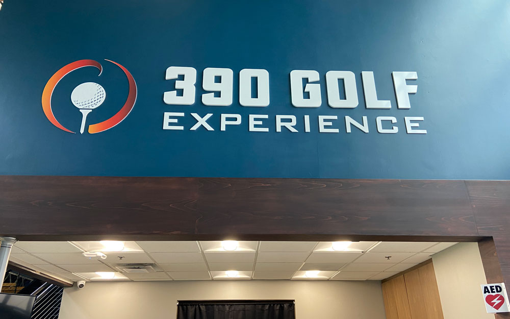 For the interior entry sign, AlphaGraphics sourced the acrylic letters from Gemini. The large letters spelling out “390 Golf” are 18 inches tall-by-107 inches wide and made from .75-inch acrylic. The smaller letters spelling out “Experience” are 7.5 inches tall and made from .375-inch acrylic.
The logo next to the letters featuring a circle, golf ball, and tee are 36 inches around and made from .25-inch acrylic. The elements were fabricated in-house using the shop’s Colex Sharpcut and printed on its EFI Pro 16h. The logo elements were actually one of the first jobs on the shop’s new EFI printer.
Utilizing an internal scaffolding system still up from the building renovation, AlphaGraphics installed the letters and logo on the wall. To install the acrylic letters, holes were drilled into the wall and the letters were stud mounted. The logo elements were applied to the wall using adhesive.
Wayfinding
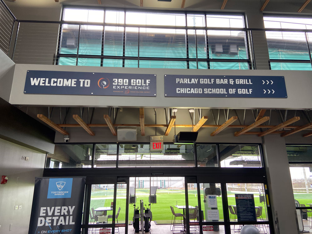
AlphaGraphics provided a variety of wayfinding signage for the facility, including two large signs installed with standoffs at the front entrance and smaller signs identifying locations like the restrooms. These signs were made from Dibond®, printed on the EFI Pro 16h, and cut using the shop’s Colex Sharpcut.
 Vinyl Graphics
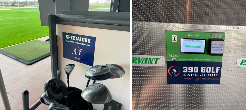
Vinyl graphics were also featured throughout the facility in the form of window graphics, identity signage for places like the golfing bays, and 390 Golf branding. Briteline® vinyl from Grimco was used for all of the vinyl pieces.
The Back 9: Outdoor Signage
Similar to the discussion around the indoor signage, AlphaGraphics advised the Park District to go with illuminated signage on the outside of the building. However, given their budget, the Park District wasn’t ready for that, so the sign company came up with the solution to use large Dibond signs on the outside.
“The company that was doing the lighting for the building, for the interior lights, approached them, and they actually put some lights above the signs to illuminate the non-illuminated signage outside,” says Bittner. “I believe, for them, [the outdoor signs are] potentially going to be a three- to five-year solution and then they’ll put up lighted signage.”
The other issue was that when the previous tenant’s sign was removed, it left holes from the fasteners, an outline on the building, and discolored concrete below where the sign had been hung. To keep within the Park District’s budget, AlphaGraphics decided to make the Dibond signs big enough to cover up the marks.
“They wanted a nice, clean look,” says Bittner. “We were able to take that art and make it big enough so that it had an impact on the size of the sign.”
In sizing the art, Bittner says the biggest challenge was making sure the signage was large enough to cover the affected areas while also not ending in one of the grooves in the concrete wall, which would have made installation difficult.
The shop settled on two Dibond signs measuring 42 inches-by-12 feet long and 42 inches-by-23 feet-long, depicting the 390 Golf Experience logo, which were  installed on two sides of the building. The signs weren’t laminated since they would only be up for three to five years and because the laminate can shrink over time.
For the install, AlphaGraphics rented a forty-foot boom lift truck. The installers had to set the truck up about eighteen feet away due to a bricked-in area next to the building that housed dumpsters and other equipment. Both signs were screwed into the concrete using Tapcon screws.
The wider of the two signs, at the front of the building, was installed in three sections. The other 390 Golf sign was installed in two pieces. The two locations on the building were chosen because they face the highway.
“Because the highway is elevated, the signage is almost at eye level when you’re driving on the highway,” says Bittner. “So even though it’s at the top of the building, since the road is up so high, you’re almost even with it when you’re driving past it.
“So it’s a really nice little billboard on the side of the building.”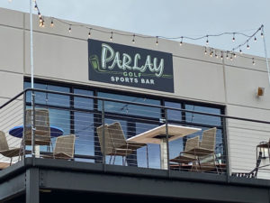
AlphaGraphics also installed a sign for the Parlay Sports Bar, which was put up in one piece and screwed into the building using Tapcon screws. Service equipment wasn’t needed since they could access the install location from a balcony outside the restaurant.
All of the outdoor signs were installed in about half a day.
Finishing Hole
When everything was finished, the Park District felt like it had hit a hole-in-one—especially after supply chain and COVID-related issues had delayed the development of the project.
“That was the bow that they were waiting to tie on the package,” says Bittner. “This came together, and they felt like, ‘Well, here it is, we can see it. Our vision is finally here.’”
AlphaGraphics was also happy to see the project reach completion.
“You feel like you helped somebody really feel good about what they were doing in a time where there was just nothing but chaos,” says Bittner. “It was a lot of fun.”
The post This Signage Package is an Ace in the Hole appeared first on Sign Builder Illustrated, The How-To Sign Industry Magazine.
Posted by: https://anaheimsigns.com
No comments:
Post a Comment